 INDIZILLA
Fourteen directions. One business. Pick the one that is yours.
Most studios have one house style, and every client gets a version of it. We wanted to know how far a brand can travel and still be itself, so we built fourteen complete websites for the same business: 323 pages, fourteen grids, fourteen palettes, fourteen voices, one mark and one price list.
All fourteen work. All fourteen are on this site and you can walk through every one. Any of them can be pointed at your business instead of ours, which is the point: this is the range, and underneath it is the part that actually matters, which is knowing which one a business needs and saying what it costs.
The part you are actually hiring.
Anyone can show you a nice page. What a folder of nice pages cannot show you is judgement, which is the thing you are paying for: knowing which of fourteen good ideas belongs on your website, and being willing to say out loud what it will cost you. These are the rules we work to. Each one was earned on a complete build, and each is listed with the directions that taught it.
-
01
Count what a visitor can do.
Before judging a page on how it looks, count the things on it that can be pressed. Across these fourteen the range is 24 to 136 on the home page alone, and it predicts how a page performs better than any opinion about it does. It is also the first number we take on a site we are asked to fix.
Editorial The Weave -
02
Demonstrate, do not describe.
A page can show the listing climbing past its neighbours, the week filling, the panel answering. Most pages instead say that the business does those things. Showing costs more once and converts every day after, which is why the working miniatures outlived the sites they were built for.
Live Product The Showroom -
03
Pick the direction from the buyer, not the brief.
A business does not need the design the owner likes. It needs the one that answers how its buyer decides: whether they read, glance, need to see the thing run, or need walking through it. That is why the fourteen here are filed by buyer and not by date.
The Weave Negative Space -
04
Loud is not the same as confident.
When everything on a page shouts at once the volume reads as insecurity, and nothing can be emphasised because everything already is. Confidence is one large thing with a great deal of silence around it.
Full Volume -
05
Effects date. Interaction does not.
A tilt, a parallax, a custom cursor: each one carries the date it was fashionable, and a client is left paying for a redesign three years early. Something a visitor does, and gets a real answer to, does not age the same way.
Deep Interface The Conversation -
06
Borrow the grammar, never the costume.
A reference used well is invisible. If your audience can name it, you copied the wrong layer, and the brand now belongs to whoever you copied.
Negative Space -
07
A grid is a floor, not a ceiling.
Discipline stops a page being wrong and it cannot make a page worth looking at. Fixing composition by taking things away usually takes the design with it, so the grid goes in first and the art goes on top of it.
The Grid The Magazine -
08
A house typeface is not a limitation.
If the family gives you no stroke contrast to be dramatic with, take the drama from the other three levers: weight, scale, and tracking pulled tight enough that a headline reads as one object. A brand that changes typeface to look special has stopped being a brand.
The Magazine -
09
A generated page looks generated.
Forty six pages out of one procedure read as forty six copies of one page, and a visitor feels it without being able to say why. The pages that carry a site get written one at a time; only the repeating ones are generated, in the same vocabulary.
The Grid The Showroom -
10
Say what the direction costs.
Every one of these has a price: photography, maintenance, a slower read, a narrower audience. A studio that names the cost before you commit is a studio that has built the thing before. Every direction on this page carries its trade-off in writing.
Full Volume The Preview
Fourteen working sites, not fourteen mockups.
Every frame below is a real site with real pages behind it, built on the same prices and the same mark. Press any of them to read what it is for, what it is made of, and what it would cost you to choose it.
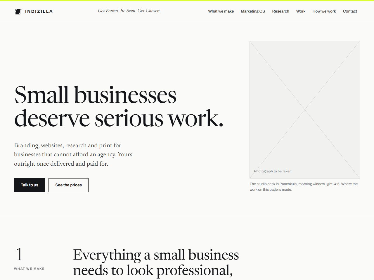 01 Editorial
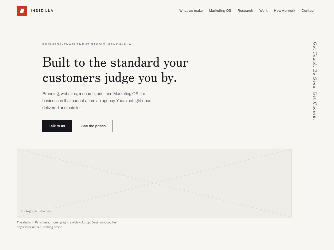 02 Negative Space
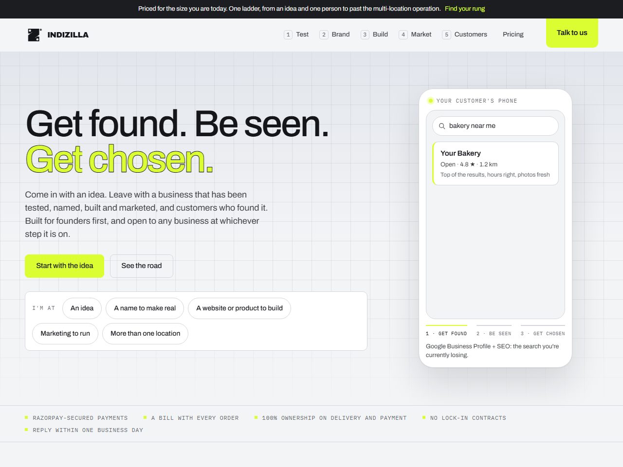 03 The Journey
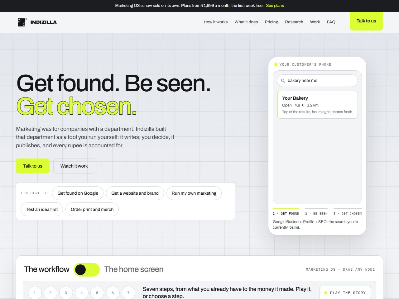 04 Live Product
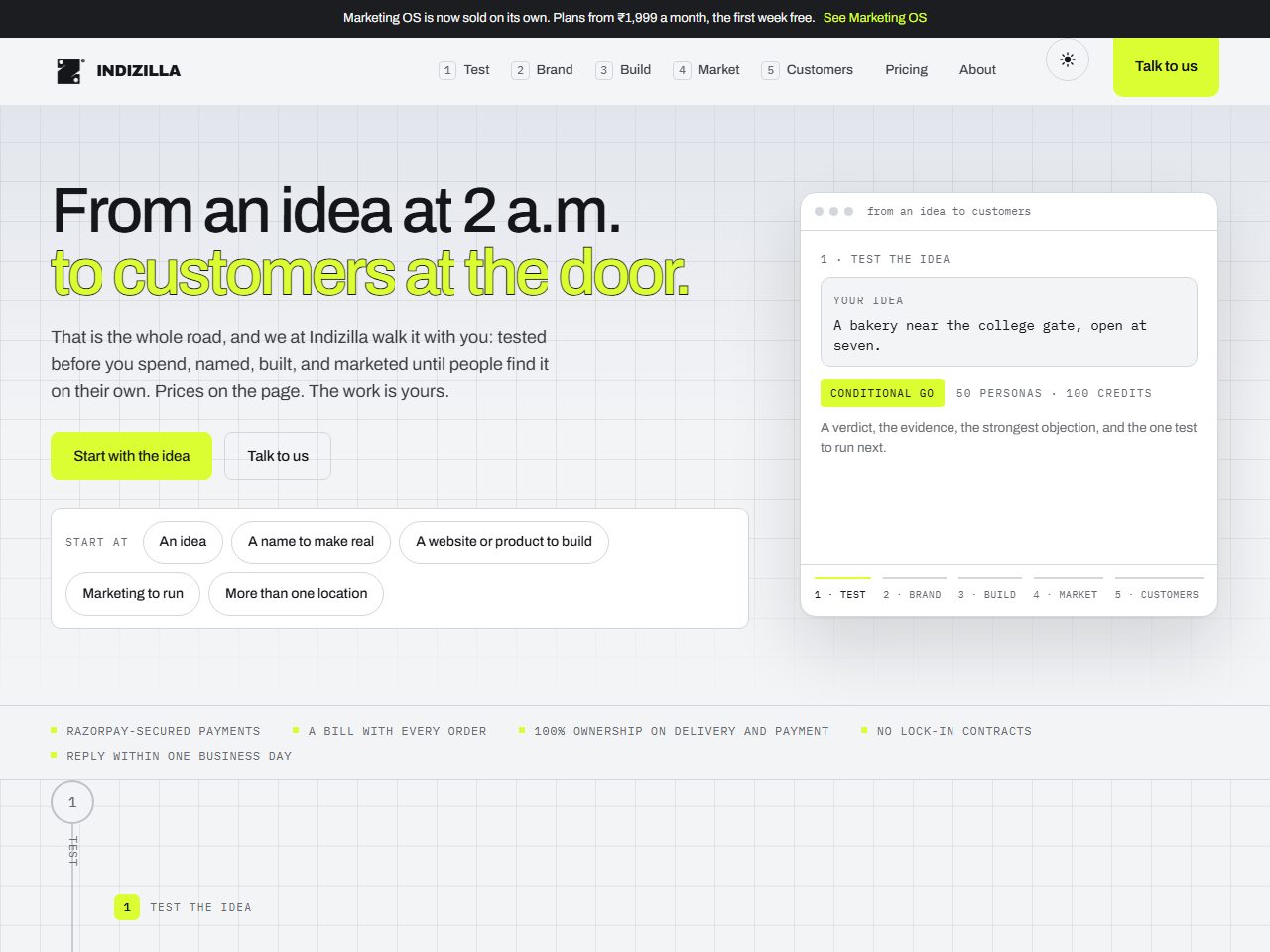 05 The Road
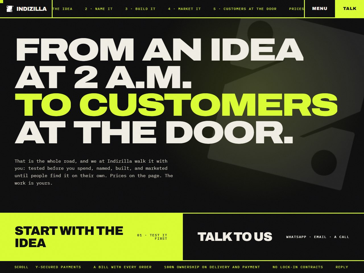 06 Full Volume
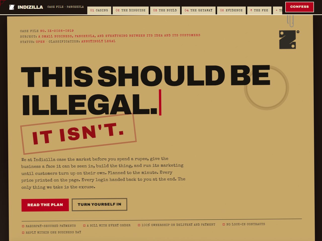 07 The Case File
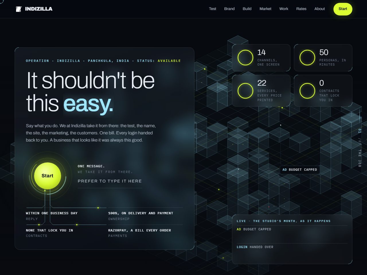 08 Deep Interface
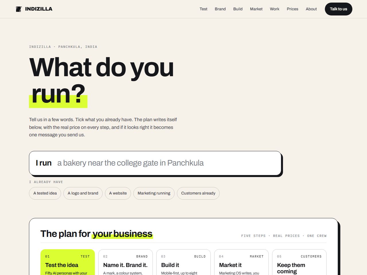 09 The Conversation
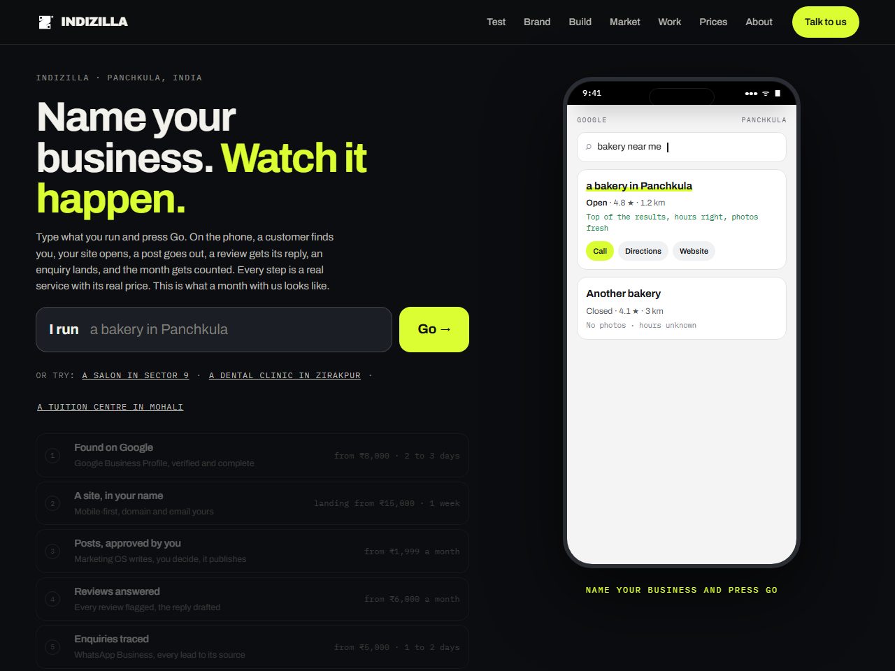 10 The Preview
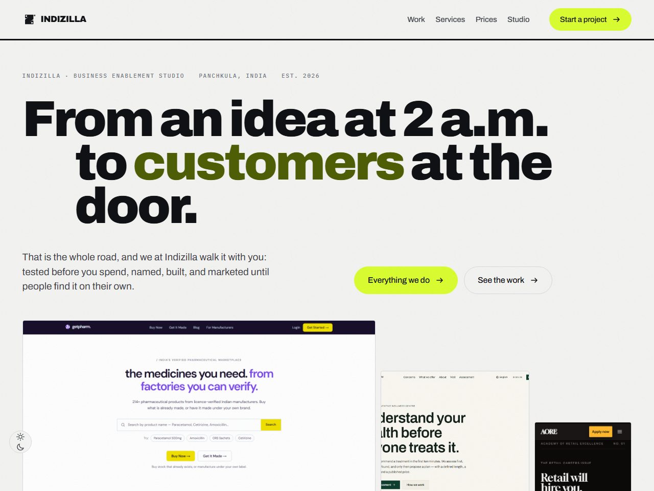 11 The Showroom
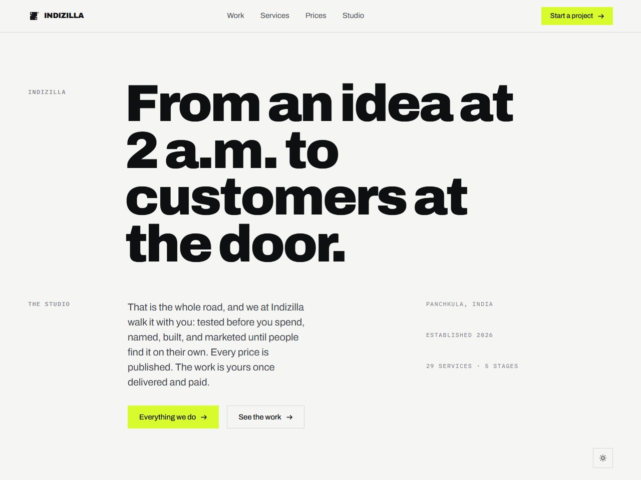 12 The Grid
 13 The Magazine
 14 The Weave
- The one we chose for ourselves
- Built into it
- Available, and waiting for the right business
Where the buyer reads before they call
The sale is made by the writing and the setting of it. These are for a practice, a maker or a publisher whose buyer wants to know you are serious before they will speak to you, and who will give you four hundred words to prove it.
Editorial A studio portfolio, printed
Right for A practice that sells expertise and expects to be read: consultants, clinics, architects, a law firm, anyone whose buyer does their homework before they call.
What it costs you It reads beautifully and it asks a great deal. Twenty four things on the whole page can be pressed, so a visitor who wants to act rather than read has almost nowhere to go. Choose it when your buyer reads, and pair it with a loud contact page.
1 page · 24 controls · Available
See the direction
02
Negative Space Composition borrowed, ornament refused
Right for A premium or handmade product where restraint is the message: jewellery, skincare, a chef’s table, a single-product brand that wants to be the expensive one.
What it costs you Empty space is expensive: it says the price is high and it slows the reader down. That is exactly right for a maker and exactly wrong for a business competing on being easy to deal with.
1 page · 24 controls · Available
See the direction
12
The Grid Composition as the argument
Right for A brand whose credibility rests on precision: architecture, engineering, industrial design, or a studio whose buyer will notice a misaligned edge and quietly discount everything else you said.
What it costs you Discipline stops a page being wrong and cannot make it worth looking at. On its own this is correct and cold; it wants a strong imagery treatment sitting on top of it.
46 pages · 81 controls · Available
See the direction
13
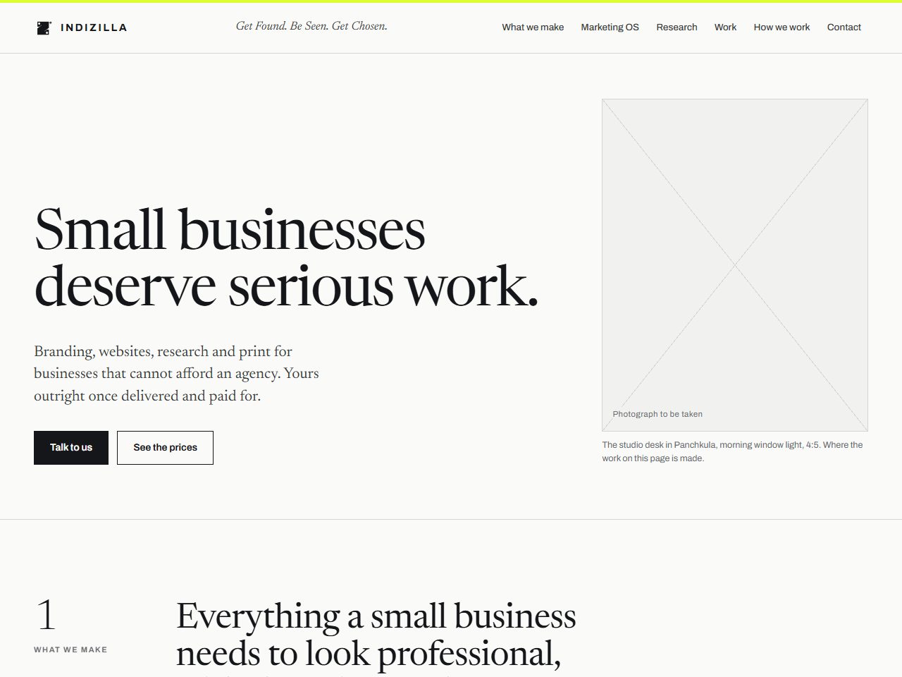
The Magazine A magazine that still sells
Right for A brand that publishes and has photography worth printing large: fashion, hospitality, food, travel, interiors. It is the direction for a business whose product is partly an aspiration.
What it costs you A magazine needs pictures, and it is merciless about bad ones. Commit to the photography budget or choose another direction.
46 pages · 111 controls · Available
See the direction
Where the buyer decides in three seconds
Attention is the whole game and the page has one chance to be remembered. These are for a brand selling to a young audience, or any business whose competition all look the same and sound the same.
Full Volume A poster you walk through
Right for A brand that sells to a young audience on attention: streetwear, a gym, an event, a drinks label, a studio that would rather be remembered than liked.
What it costs you At full volume every element is shouting, and a page where everything shouts has no way to emphasise anything. Turn two of the three effects off and it gains authority; the stylesheet is built so each one comes out in a minute.
23 pages · 57 controls · Available
See the direction
07
The Case File Narrative as the whole design
Right for A brand with a real voice and something to say, where the story is the difference rather than the price list. It rewards a business that is prepared to commit to a bit.
What it costs you A voice this strong is a costume the buyer has to see through before they can read a price. It converts the people who already like you and it can cost you the people who have not decided yet.
23 pages · 76 controls · Available
See the direction
Where the product is invisible until it runs
Nobody buys software from a screenshot, and nobody buys a service they cannot picture. These directions put the thing on the page and let it work in front of the visitor.
Live Product Sell it by running it
Right for Software, or any service whose value is invisible until somebody watches it work. If your demo is currently a screenshot, this is the direction.
What it costs you A working miniature costs several times what a screenshot costs to build, and it has to be maintained when the product changes. It is worth it exactly once: on the page that has to convert.
1 page · 97 controls · In use here
See the direction
08
Deep Interface Calm glass over a working machine
Right for A technical product with genuine machinery behind it: fintech, logistics, anything where competence is the pitch and the buyer is technical enough to be unimpressed by adjectives.
What it costs you A canvas running under the whole page is a real cost on an old phone, and pointer-driven tilt ages faster than anything else on this list. Keep the city, drop the tilt.
23 pages · 62 controls · Available
See the direction
09
The Conversation The visitor does something
Right for A service with many configurations, where the honest answer to what does it cost is it depends, and the buyer has to be asked two questions before you can say.
What it costs you Interaction that answers is necessary and it is not sufficient. On its own the page is useful and forgettable, which is why it works best carrying a stronger visual direction on top.
23 pages · 94 controls · Available
See the direction
10
The Preview Watch the result before you buy it
Right for A business whose result takes months to appear: marketing, training, recruitment, anything where the buyer has to imagine the outcome and usually imagines it badly.
What it costs you The demo runs for fifteen seconds and the page waits for it. A visitor arriving mid-scroll has missed the plot, so every section has to read standing still as well, and that is extra work most teams skip.
23 pages · 69 controls · Available
See the direction
Where the buyer has to be walked through it
A catalogue, a sequence, several services bought in an order. These are for a business whose visitor arrives not knowing what they need, which is most businesses.
The Journey One page, one road
Right for A business whose visitor does not yet know what they need, and has to be taken from the problem they arrived with to the thing that fixes it, in order.
What it costs you A road only works if your services genuinely happen in an order. Impose one where there is none and the visitor feels handled rather than helped.
1 page · 104 controls · In use here
See the direction
05
The Road A whole site on one spine
Right for A business with several services that are bought in a sequence, and a catalogue big enough that a visitor needs telling where to start.
What it costs you It is a big site and a big build. A business with three services will rattle around inside it.
29 pages · 121 controls · Available
See the direction
11
The Showroom Every service behind glass
Right for A catalogue business where each item deserves its own case: a services firm, a treatment list, a product range where the difference between items is the thing that has to be explained.
What it costs you Twenty nine working miniatures is twenty nine things to build and maintain. Start with the six services that actually close, and leave the rest as type.
46 pages · 113 controls · Available
See the direction
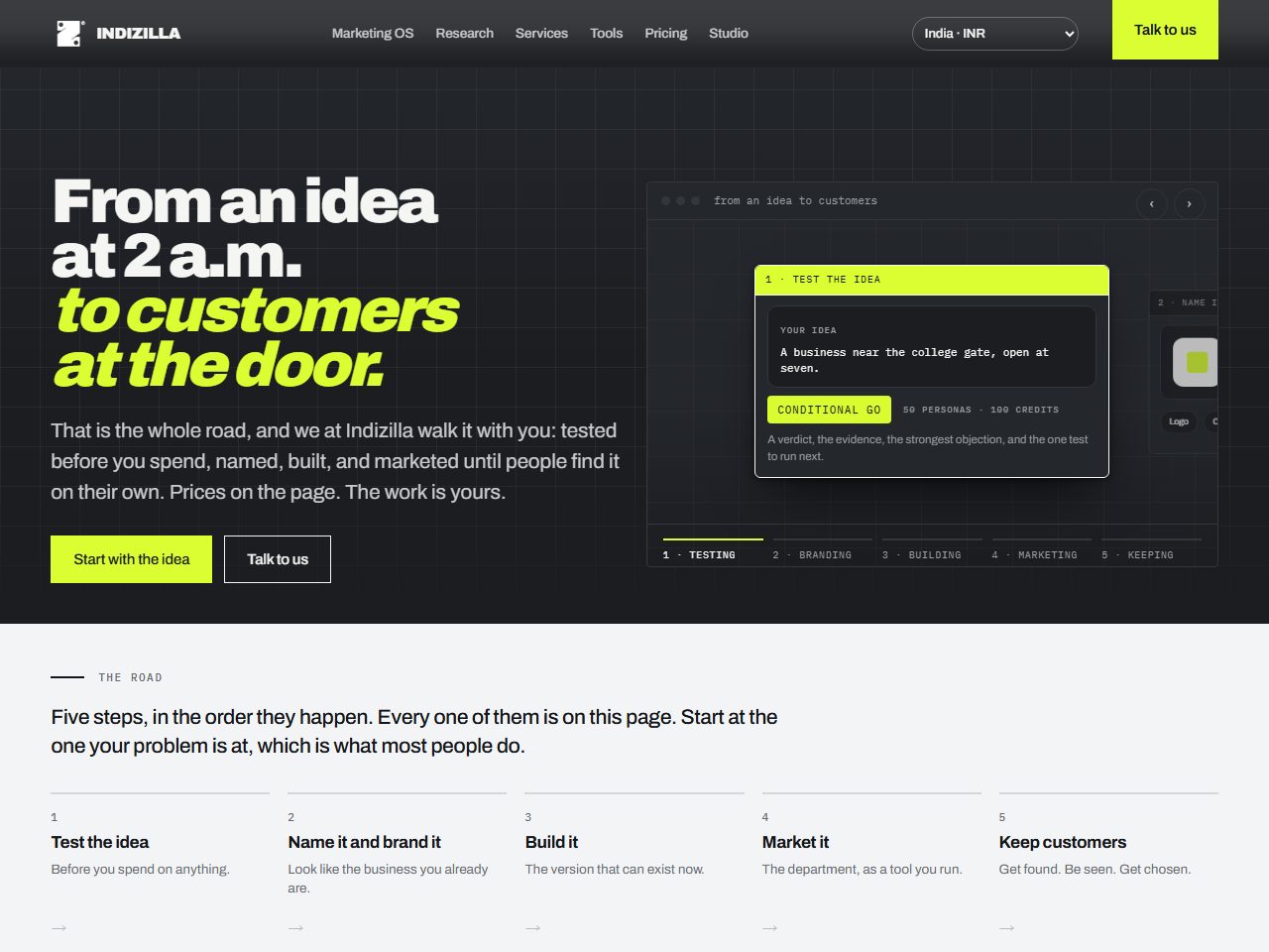
14
The Weave The one we chose for ourselves
Right for Us. A studio selling several services to a buyer who has to be shown, in order, and who needs a price before they will write to you.
What it costs you It is the right answer for this business and it would be the wrong one for a jewellery brand or a gym, which is the whole reason the other thirteen are on this page.
37 pages · 136 controls · This site
See the direction
Work that shipped.
Range is only half of it. Here is the other half: five businesses, live, with the decisions written down and the before and after published where there is one.
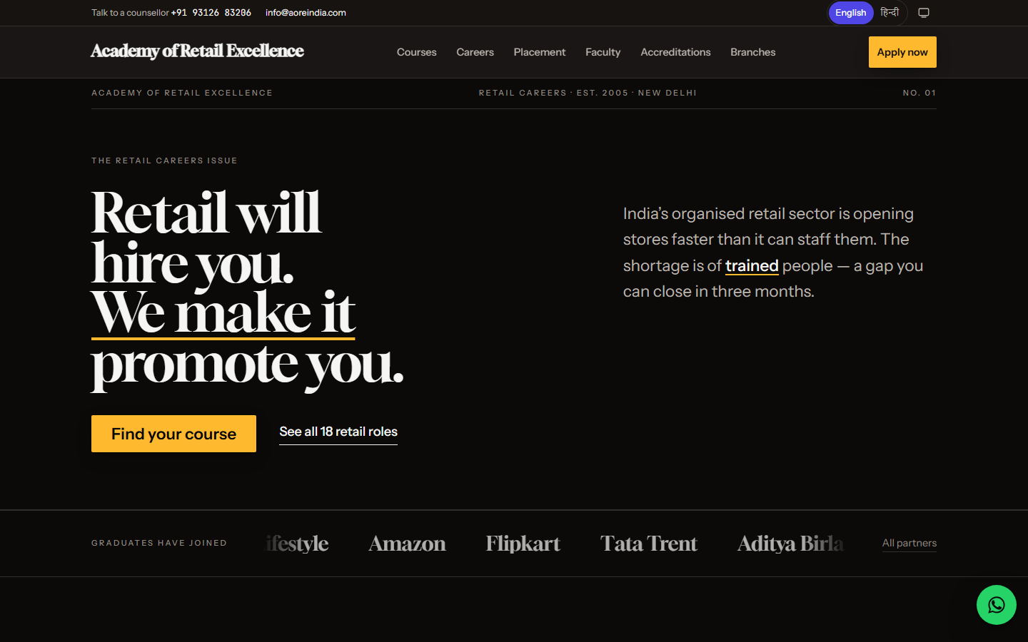 Education · the whole site
Academy of Retail Excellence
A retail training academy whose site was costing it enrolments. Rebuilt end to end, and the before and after is published side by side.
Read the study
Education · the whole site
Academy of Retail Excellence
A retail training academy whose site was costing it enrolments. Rebuilt end to end, and the before and after is published side by side.
Read the study
 B2B marketplace · brand and platform
GetPharm
A verified B2B marketplace for pharmaceutical manufacturing: systems design, branding, and a gate that checks a licence before a listing goes up.
Read the study
B2B marketplace · brand and platform
GetPharm
A verified B2B marketplace for pharmaceutical manufacturing: systems design, branding, and a gate that checks a licence before a listing goes up.
Read the study
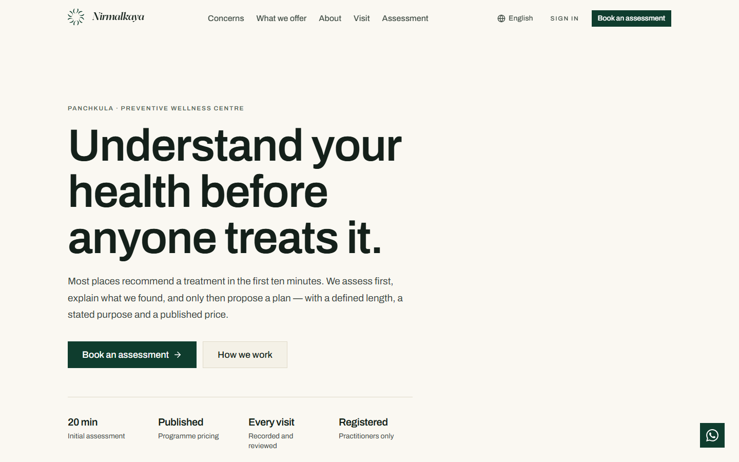 Wellness · Panchkula
Nirmalkaya
A preventive wellness centre that assesses before it treats, and a site built the same way round. Published in English and Hindi.
Read the study
Wellness · Panchkula
Nirmalkaya
A preventive wellness centre that assesses before it treats, and a site built the same way round. Published in English and Hindi.
Read the study
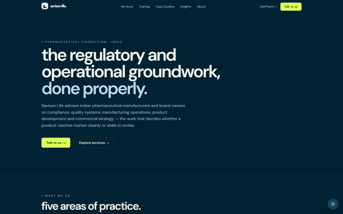 Brand and platform
Savison Life
Brand and platform groundwork designed as one system, so the mark, the product and the interface were drawn against each other rather than in sequence.
Read the study
Brand and platform
Savison Life
Brand and platform groundwork designed as one system, so the mark, the product and the interface were drawn against each other rather than in sequence.
Read the study
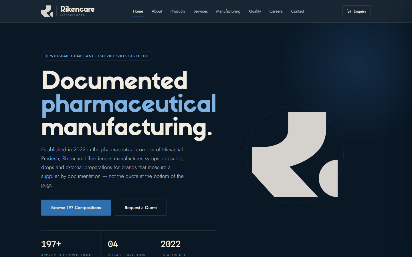 Pharmaceutical manufacturing · Himachal Pradesh
Rikencare Lifesciences
A manufacturing plant with excellent output and no website. The trust signals a procurement team checks in the first five minutes, built in five pages.
Read the study
Pharmaceutical manufacturing · Himachal Pradesh
Rikencare Lifesciences
A manufacturing plant with excellent output and no website. The trust signals a procurement team checks in the first five minutes, built in five pages.
Read the study
Tell us about your business, and we will tell you which one it is.
That answer is free and it takes one conversation. Brand identity starts at the price printed on the services page, the work transfers to you outright on delivery and payment, and nothing publishes without your approval.