 INDIZILLA
Negative Space
Japonisme as composition, not costume. No brushstrokes, no circles, no Japanese characters. What is borrowed is the way space is used: the text small and set low or to one side, and most of the screen left empty on purpose.
A premium or handmade product where restraint is the message: jewellery, skincare, a chef’s table, a single-product brand that wants to be the expensive one.
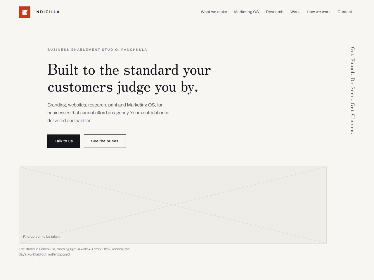
Compose the same content a completely different way, and find out how far the brand travels before it stops being the brand.
The whole thing is standing, every page of it, built on the same prices and the same mark as this site. It is marked on every screen as a direction rather than the live site, and the figures printed inside it are the ones published on the day it was built.
How it was built to look like itself.
- #F7F6F2Washi
- #14161AInk
- #C8371FShu, the seal
- #EFEDE7Second paper
Zen Old Mincho
400 at 56px, tracking -0.28px
Chosen after rendering Zen Old Mincho, Shippori Mincho, Noto Serif JP, Kaisei Tokumin and Archivo side by side. Its Latin keeps the Mincho stroke contrast without reading as a costume font.
A twelve column grid used asymmetrically, and no section repeats another section’s shape.
One gesture. Figures settle into place over 700ms as they arrive.
Section names run vertically down the left margin, like the label on a hanging scroll, pinned while the section scrolls. The brand mark becomes a seal, white on a vermilion square, used three times in the whole page and never a fourth.
The most disciplined thing here. It is the only direction that took a reference and refused its ornament, and it is where the house rule about references comes from.
Empty space is expensive: it says the price is high and it slows the reader down. That is exactly right for a maker and exactly wrong for a business competing on being easy to deal with.
Borrow the grammar, never the costume. If your audience can name the reference, you copied the wrong layer.