 INDIZILLA
Deep Interface
The surface never raises its voice, and underneath the whole page a small city keeps working.
A technical product with genuine machinery behind it: fintech, logistics, anything where competence is the pitch and the buyer is technical enough to be unimpressed by adjectives.
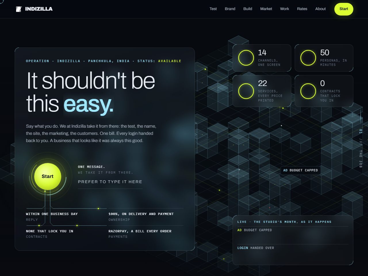
Easy. The 2030s. The modern operation, and above all built to convert.
The whole thing is standing, every page of it, built on the same prices and the same mark as this site. It is marked on every screen as a direction rather than the live site, and the figures printed inside it are the ones published on the day it was built.
How it was built to look like itself.
- #070A0FNear black
- #9FE8FFIce
- #DAFE31One lime
- #E9EEF4Text
Archivo
200 at 92.16px, tracking -2.7648px
The only hairline setting of the fourteen. At 200 the family stops looking like a workhorse and starts looking like an instrument.
Glass. Every section floats on a translucent card, so the ground shows through the whole way down.
A fixed isometric canvas city, twenty four by twenty four, with lit windows, couriers running lime lanes, and the month surfacing as events over the tiles. A scan draws the interface in during the first second.
One lime reactor button, and nothing else on the page glows.
Depth. It is where we learned that calm on the surface with visible machinery underneath reads as competence, and that adding effects is not the same as adding depth.
A canvas running under the whole page is a real cost on an old phone, and pointer-driven tilt ages faster than anything else on this list. Keep the city, drop the tilt.
Effects date. Interaction does not.