 INDIZILLA
Fourteen sites for one business. Two of them shipped.
Between 16 and 25 September we rebuilt indizilla.com fourteen times. Not fourteen mockups: fourteen working sites, 323 pages of them, each with its own grid, its own palette, its own voice and its own argument. Two went live. The rest are still standing, and you can walk through every one.
Most studios show you the work that won. That is the easy half. This is the other half, with the reason each one lost written under it, because the reason is the part you can actually use.
Every frame, and the two we circled.
A photographer marks a contact sheet before anyone sees the pictures: a ring around the frame that works, a cross through the ones that do not. Here is ours. Press any frame to read what it was for and why it is marked the way it is.
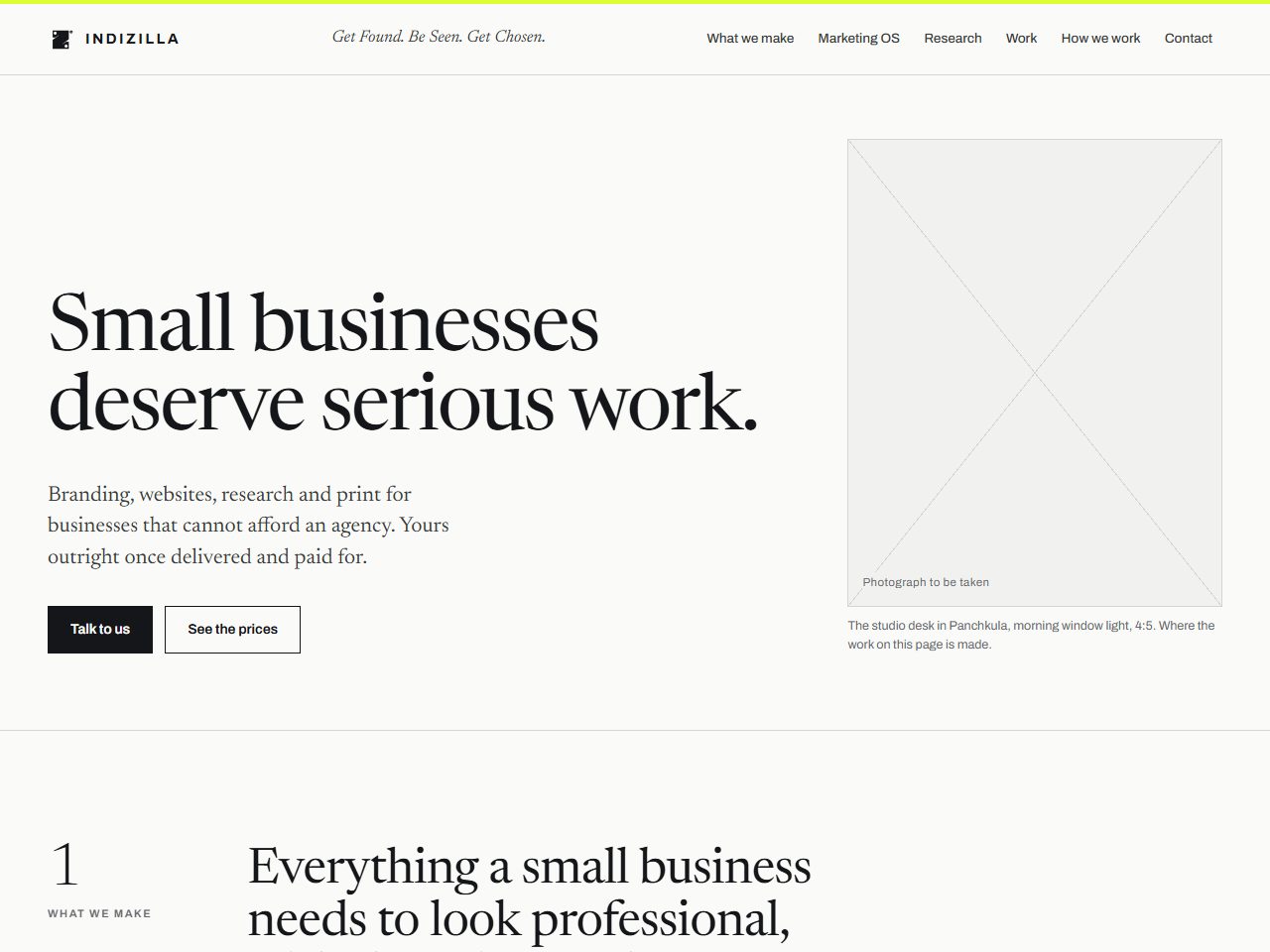 01 The Magazine 16 Sep
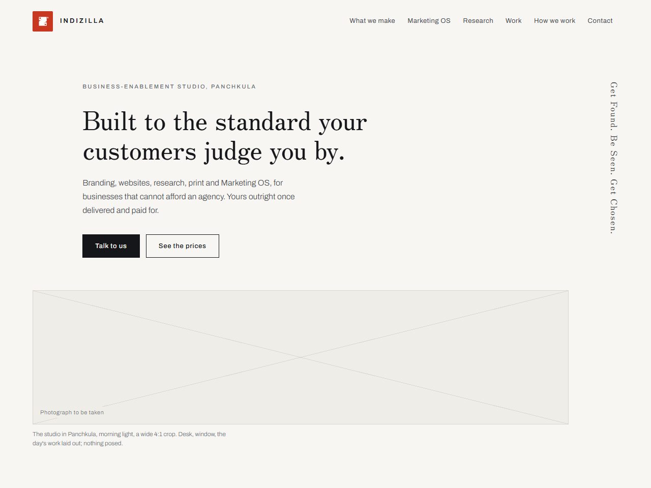 02 Japonisme 17 Sep
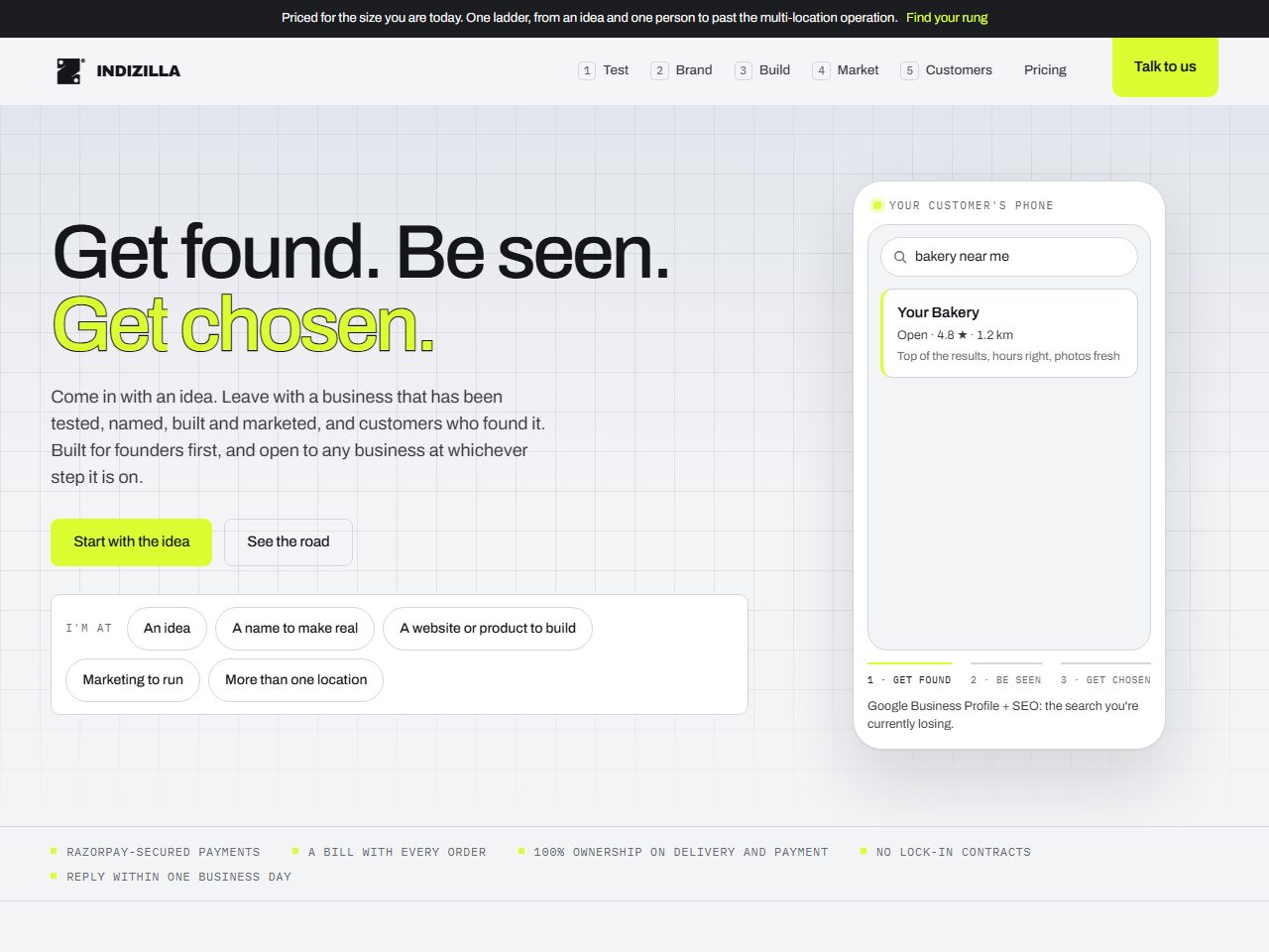 03 The Spine 18 Sep
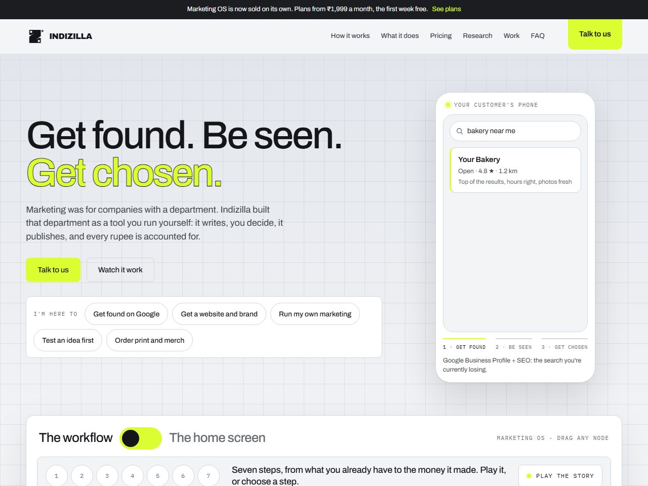 04 The Product Page 18 Sep
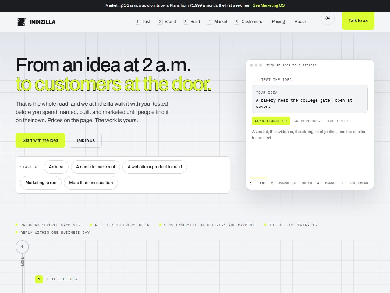 05 The Road 18 Sep
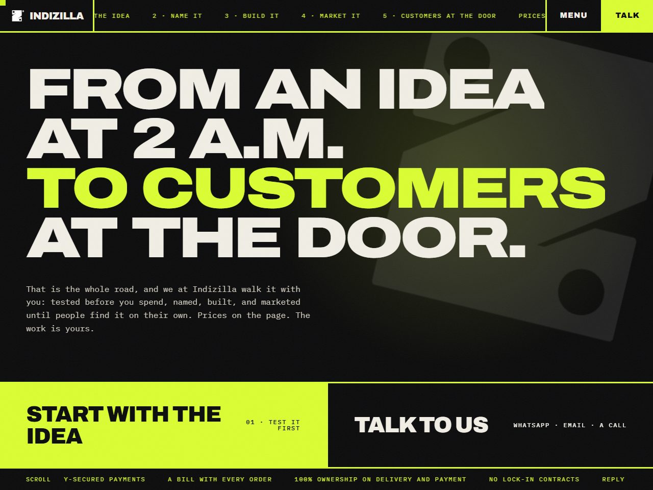 06 Berserk 19 Sep
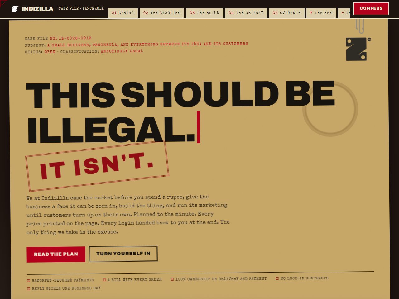 07 The Heist 19 Sep
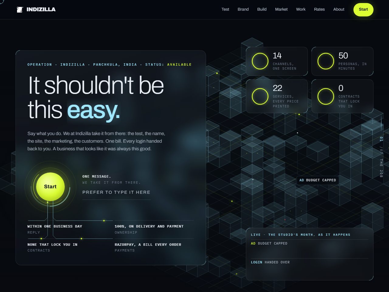 08 Ghost 19 Sep
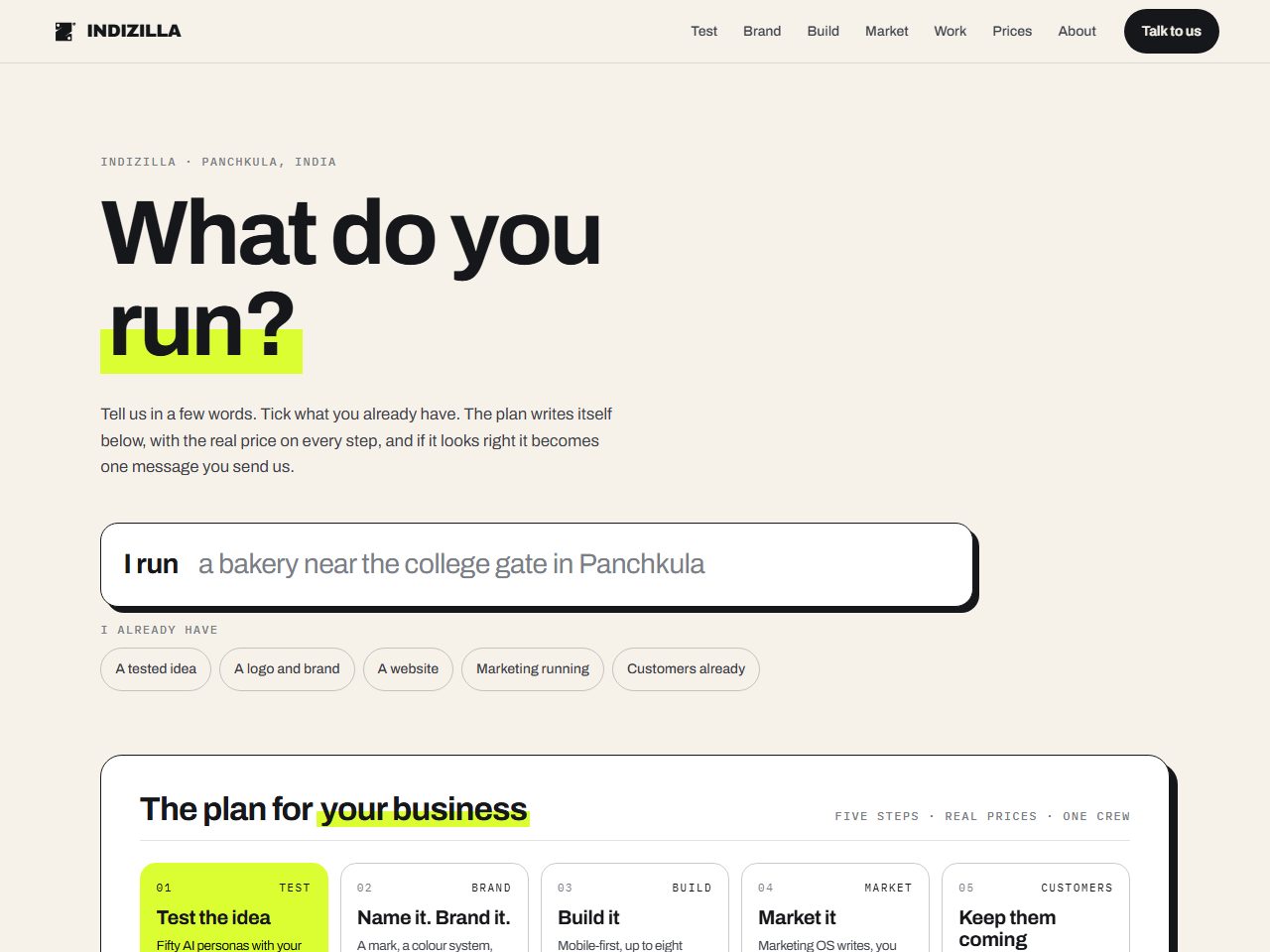 09 Play 19 Sep
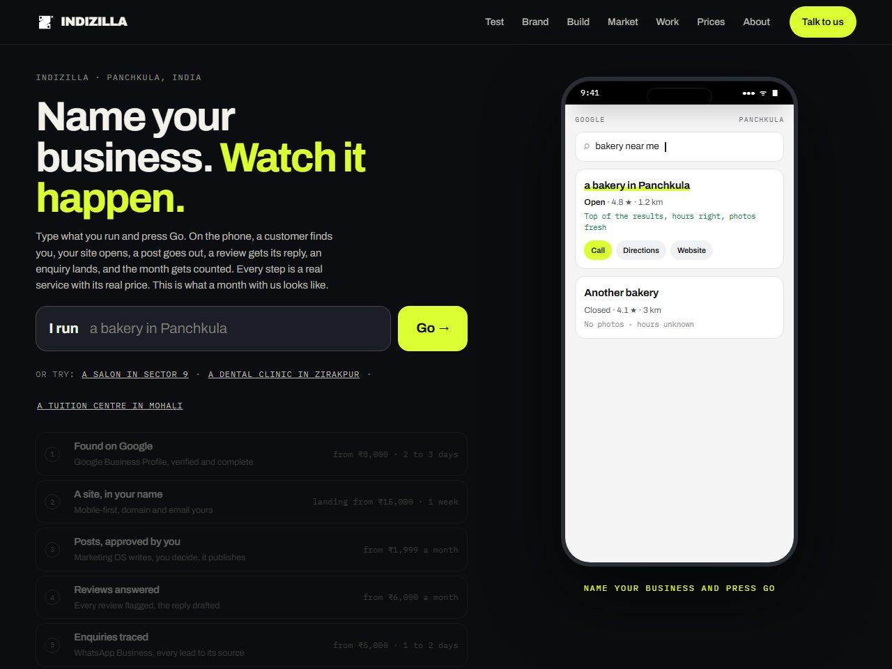 10 Cheat Code 19 Sep
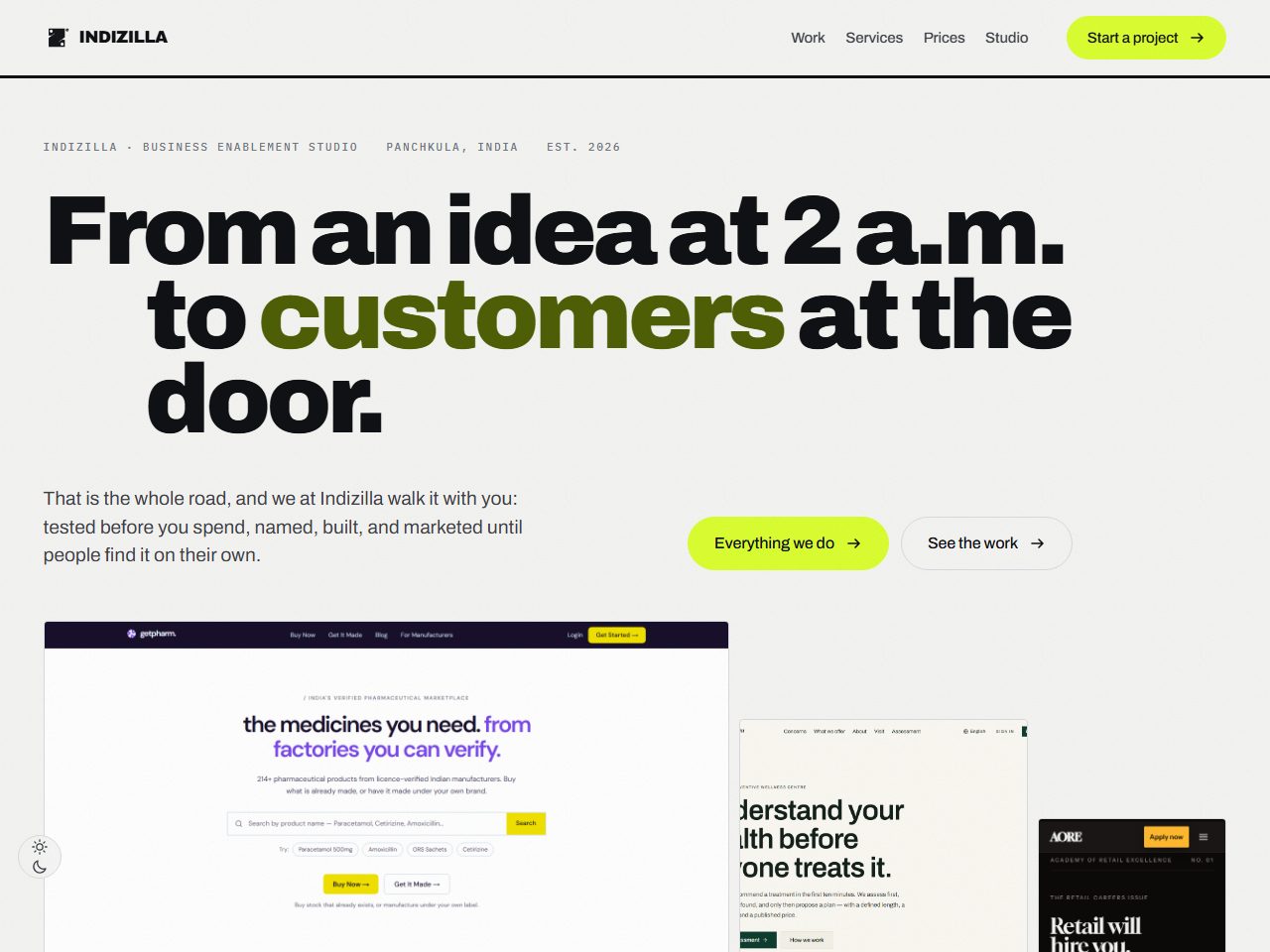 11 The Showroom 23 Sep
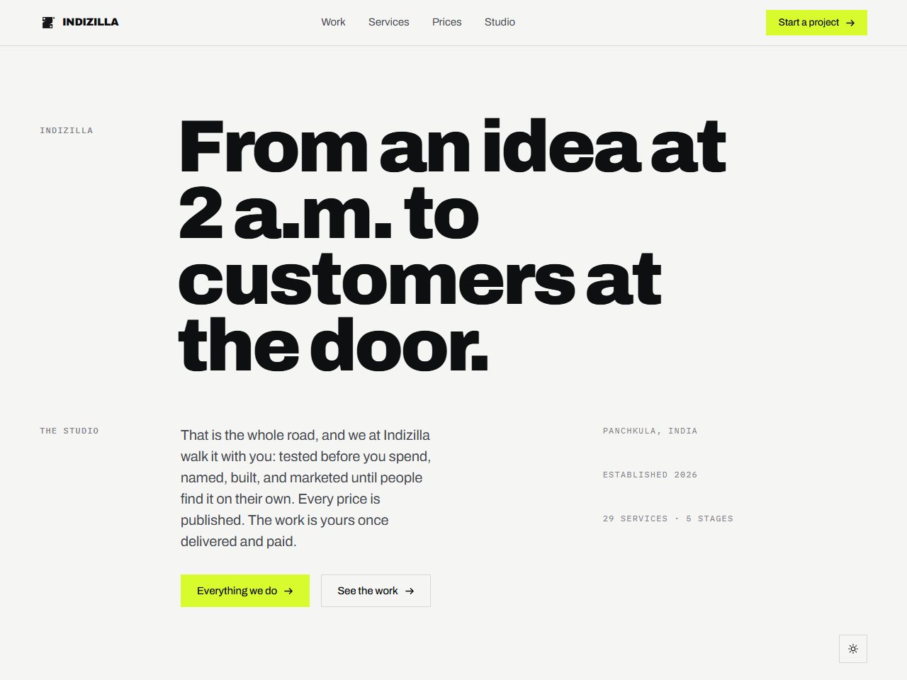 12 The Grid 23 Sep
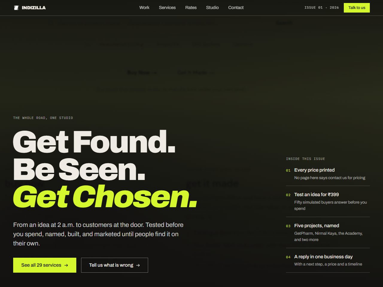 13 The Issue 23 Sep
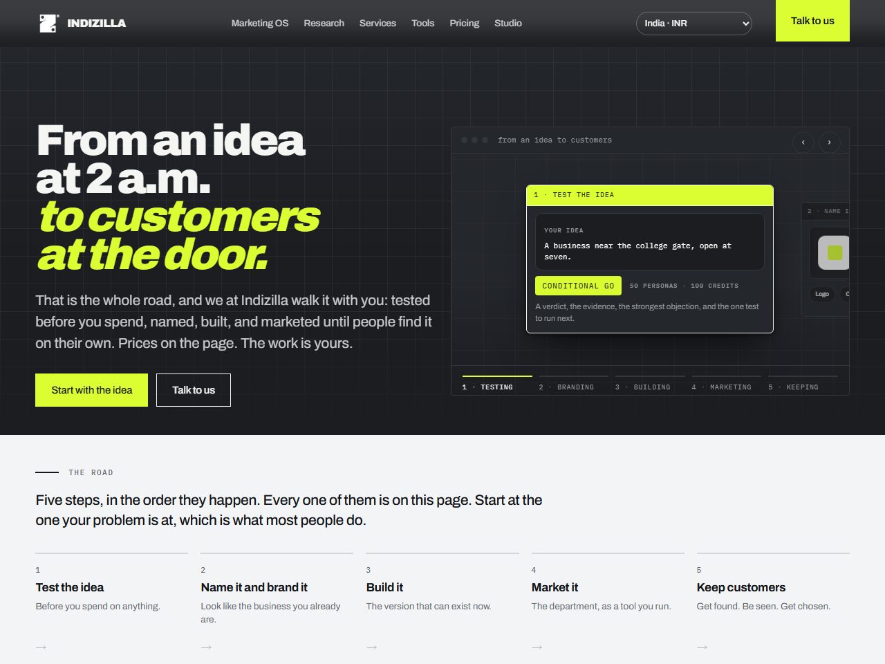 14 The Weave 25 Sep
- Shipped, or live now
- Not shipped, but carried forward into the site that was
- Killed, and here is why
The rejects are the proof.
Anyone can show you three nice pages. What a portfolio of winners cannot show you is judgement: the thing you are actually hiring, which is somebody who knows which of fourteen good ideas belongs on your website and can say why out loud.
So the whole graveyard is here. Fourteen finished sites is not a thing anybody can fake, and neither is a rejection note that names the fault. Read a few and you will know exactly how we think before you have paid us anything.
Every one of them was built for the business you are reading about right now, on the same prices, the same mark and the same four rules. That is the honest test of a brand: how far it can travel and still be itself.
Before there was a road
Four ways of answering the same question: who is this for, and what do they need to understand first. None of them shipped, and two of them are still running on the live site.
16 September · 1 page · 24 controls · Killed
The Magazine A studio portfolio, printed
A studio’s printed portfolio for small business owners. The typesetting is the proof of the work.
A portfolio is something you hand to a person who has already asked. Twenty four things on the whole page could be pressed. It described the work beautifully and demonstrated none of it.
The exhibit
02
17 September · 1 page · 24 controls · Killed
Japonisme Composition borrowed, ornament refused
Japonisme as composition, not costume. No brushstrokes, no circles, no Japanese characters. What is borrowed is the way space is used: text small and set low or to one side, and the rest of the screen left empty on purpose.
It is beautiful, and it is not us. A shop owner looking for a website does not need to admire the margins.
The exhibit
03
18 September · 1 page · 104 controls · Absorbed
The Spine The road, found
One page, one road, five stations: from an idea at 2 a.m. to customers at the door.
Not rejected. Absorbed. It stopped being a page and became the argument.
The exhibit
04
18 September · 1 page · 97 controls · Absorbed
The Product Page Sell it by running it
Sell the product by running it on the page. A workflow canvas you can drag, a console that publishes, a week that fills in front of you.
Absorbed, like the spine. It was never a competing site. It was the proof that a page can demonstrate.
The exhibit
The road ships
The structure the explorations had found, made into a whole site. It replaced indizilla.com on 18 September, and then it became the thing to beat.
Five faces in one day
Same business, same prices, same mark, five personalities. Built to find the ceiling of how far a brand can travel and still be itself.
19 September · 23 pages · 57 controls · Killed
Berserk A poster you walk through
The live edition is a quiet paper page. This one is a poster you walk through.
“Did a little too much, distracting.”
The exhibit
07
19 September · 23 pages · 76 controls · Killed
The Heist A case file on a desk
A case file on a desk. Every phase of the road is a phase of the plan, and every line of it is true.
A voice this strong is a costume the buyer has to see through before they can read a price. It converts the people who already liked you.
The exhibit
08
19 September · 23 pages · 62 controls · Killed
Ghost Calm glass over a working city
The surface does not raise its voice, and underneath the whole page a small city keeps working.
“The cursor just takes away from it. The buttons are gaudy. The animations are dated. The UX is not good.”
The exhibit
09
19 September · 23 pages · 94 controls · Killed
Play The visitor does something
The fun moves out of the effects and into the interaction. Three things you can do, and every one of them answers you.
“Devolving too far. Boring. The current live site is much more than this. Feels like a poorly vibe coded page.”
The exhibit
10
19 September · 23 pages · 69 controls · Killed
Cheat Code Watch your month happen
Name your business, press Go, and watch a month happen on a customer’s phone with your name written into it.
The demo runs for fifteen seconds and the whole page waits for it. It is a film, and a visitor arriving mid-scroll has missed the plot.
The exhibit
Three rebuilds from zero
Not new skins but new sites, forty six pages each, built on their own grids from their own catalogues. Each one fixed the fault before it and found a new one.
23 September · 46 pages · 113 controls · Killed
The Showroom Every service behind glass
Five rooms on one road. Every service is an exhibit behind glass, and every exhibit is a small working model of itself.
Of the first version: “only about five percent there … homogenised, no direction … links are not understandable if it is a link or a part of an image or demo.” The second version answered all three faults and was rejected anyway.
The exhibit
12
23 September · 46 pages · 81 controls · Killed
The Grid Composition, solved
One grid, one spacing scale, one type scale, and the pages that carry the site written by hand instead of generated.
It fixed composition by subtraction and took the design out with it. One typeface doing every job, no treatment on the imagery, no voice. Plain, and boring.
The exhibit
13
23 September · 46 pages · 111 controls · Killed
The Issue A magazine that still sells
Keep the grid from the attempt before and put the design back on top. The drama lives in the composition, the scale and the imagery, and the words stay plain.
“Even after this, why is the current version much better? The one that is live.”
The exhibit
The question that ended it
After thirteen attempts the founder asked why the live site was still better. We measured it. The answer changed the brief.
What fourteen attempts taught us.
None of these are opinions we brought with us. Each one cost a complete site to learn, and each one is listed with the exhibits that taught it, so you can go and check.
-
01
Count what a visitor can do.
Before judging a page on how it looks, count the things on it that can be pressed. The two editions that shipped carry 121 and 136 interactive controls on the home page. The two most admired never got past 24. Taste is hard to argue about. This is not.
The Magazine The Weave -
02
Demonstrate, do not describe.
The live page shows the listing climbing past its neighbours, the week filling, the panel answering. Every rebuild said that we do those things. Showing is the whole brand, and it is why the miniatures outlived the sites they were built for.
The Product Page The Showroom -
03
Loud is not the same as confident.
When everything on a page shouts at once, the volume reads as insecurity. Confidence is one large thing with a lot of silence around it.
Berserk -
04
Effects date. Interaction does not.
A tilt, a parallax, a custom cursor: each one carries the date it was fashionable. Something a visitor does, and gets a real answer to, does not age the same way.
Ghost Play -
05
Borrow the grammar, never the costume.
A reference used well is invisible. If your audience can name it, you copied the wrong layer.
Japonisme -
06
A grid is a floor, not a ceiling.
Discipline stops a page being wrong, and it cannot make a page worth looking at. Fixing composition by taking things away usually takes the design with it.
The Grid -
07
A house typeface is not a limitation.
If the family gives you no stroke contrast to be dramatic with, take the drama from the other three levers: weight, scale, and tracking pulled tight enough that a headline reads as one object.
The Issue -
08
A generated page looks generated.
Forty six pages out of one procedure read as forty six copies of one page. The pages that carry a site get written one at a time, and only the repeating ones get generated, in the same vocabulary.
The Grid The Showroom -
09
If nothing says it is clickable, nothing is.
An affordance is not decoration. A card with no action row is a poster, and a demo with no label is something a visitor is not sure they are allowed to touch.
The Showroom -
10
When the rebuild keeps losing, the brief is wrong.
Nine sites were built to replace one that shipped on a Thursday, and none of them did. The answer in the end was not a fourteenth rebuild. It was art direction on the thing that already worked.
The Road The Weave
This is the thinking you are hiring.
If you want it pointed at your business rather than ours: brand identity starts at the price printed on the services page, the work transfers to you outright on delivery and payment, and nothing publishes without your approval.