 INDIZILLA
Berserk
The live edition is a quiet paper page. This one is a poster you walk through.
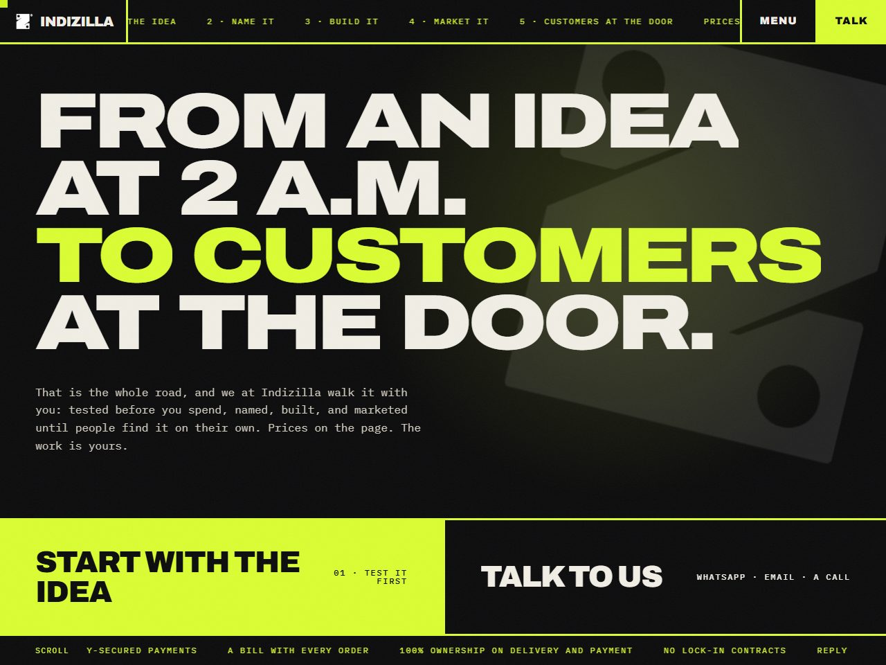
Same business, same voice, same mark, no other constraints. Maximalist. Nothing like the current site.
The whole edition is still standing, every page of it. It is marked archived on every screen, and the prices printed inside it are the ones that were published on the day it was built.
How it was built to look like itself.
- #0A0A0BCast black
- #F2EFE6Bone
- #DAFE31Molten lime
- #FF4D1FHot orange
Archivo, width axis
900 uppercase at 126.72px, tracking -6.336px
Condensed, normal and extended used inside one tagline. The width axis is the most under-used tool in a variable font, and this edition is the archive’s only real use of it.
Square corners everywhere, with no exceptions, including on software.
Film grain that moves, tickers in three places, words that slam into position, a spotlight that follows the pointer.
The road turned sideways: five full-screen stations in their own colours, travelling across the screen while the page scrolls five screens down. On touch they stack, which is the right call.
Scale. Nothing else in the archive is this confident about size, and nothing else uses the width axis at all.
“Did a little too much, distracting.”
Loud is not the same as confident. When every element shouts at once, volume reads as insecurity. Confidence is one large thing and a great deal of silence around it.