 INDIZILLA
The Conversation
The fun moves out of the effects and into the interaction. Three things a visitor can do, and every one of them answers back.
A service with many configurations, where the honest answer to what does it cost is it depends, and the buyer has to be asked two questions before you can say.
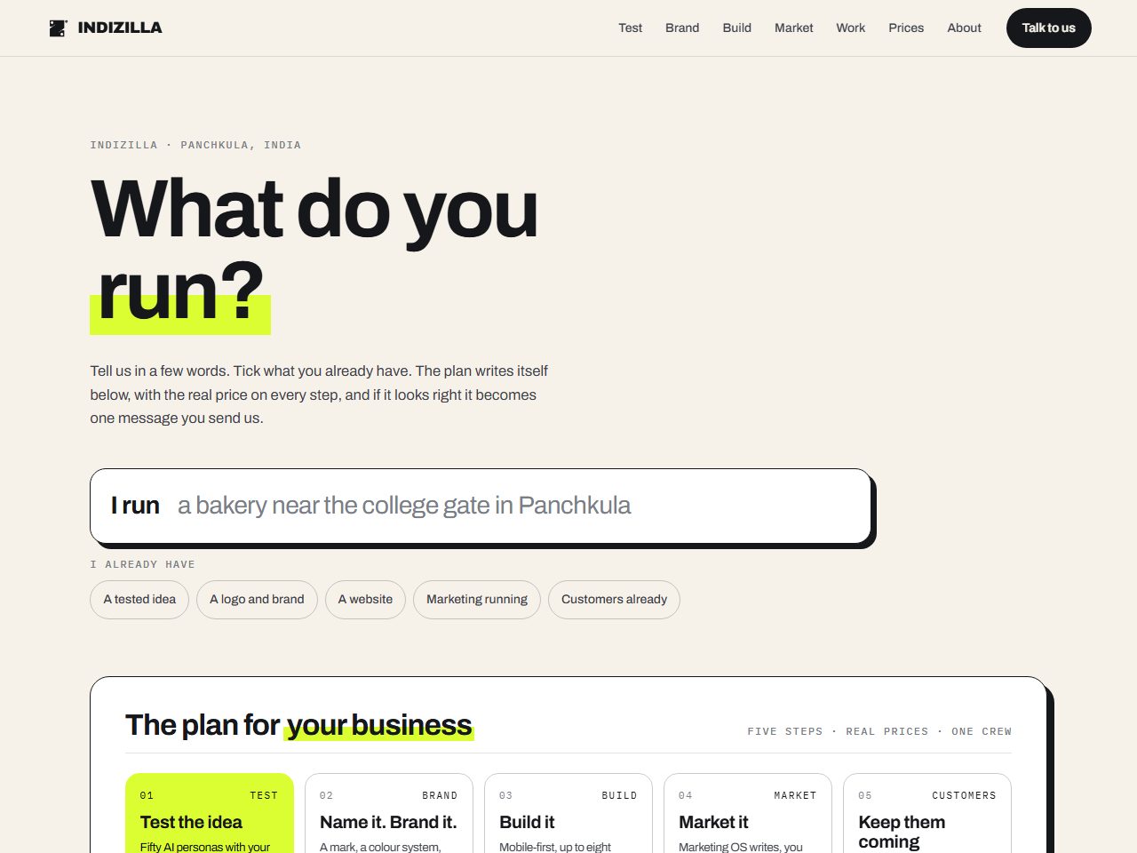
Fun and interactive without losing usability. Native cursor. Nothing that tilts, scans or follows the pointer.
The whole thing is standing, every page of it, built on the same prices and the same mark as this site. It is marked on every screen as a direction rather than the live site, and the figures printed inside it are the ones published on the day it was built.
How it was built to look like itself.
- #F6F2EAWarm paper
- #16171AInk
- #DAFE31Highlighter lime
- #FFFFFFCard
Archivo
700 at 103.68px, tracking -3.6288px
Bold headings, mono labels, and lime used the way a highlighter is used rather than the way a brand colour usually is.
White cards with a hard ink shadow. No blur, no glow, no gradient anywhere on the page.
Four words rising over half a second, once, and that is the entire motion budget.
One field that says “I run …” and five chips for what you already have. As you type and tick, the plan below rewrites itself, the steps you already have grey out, the first one you still need turns lime, and the WhatsApp message carries the whole thing.
The most usable of the fourteen, and the interactions genuinely answer the person using them rather than performing at them. A visitor leaves with a plan in their own words.
Interaction that answers is necessary and it is not sufficient. On its own the page is useful and forgettable, which is why it works best carrying a stronger visual direction on top.
Usable and memorable are two separate budgets. Spending only the first buys a form that works and nobody remembers.