 INDIZILLA
Editorial
A studio’s printed portfolio, set the way a book is set. The typesetting is the proof of the work.
A practice that sells expertise and expects to be read: consultants, clinics, architects, a law firm, anyone whose buyer does their homework before they call.
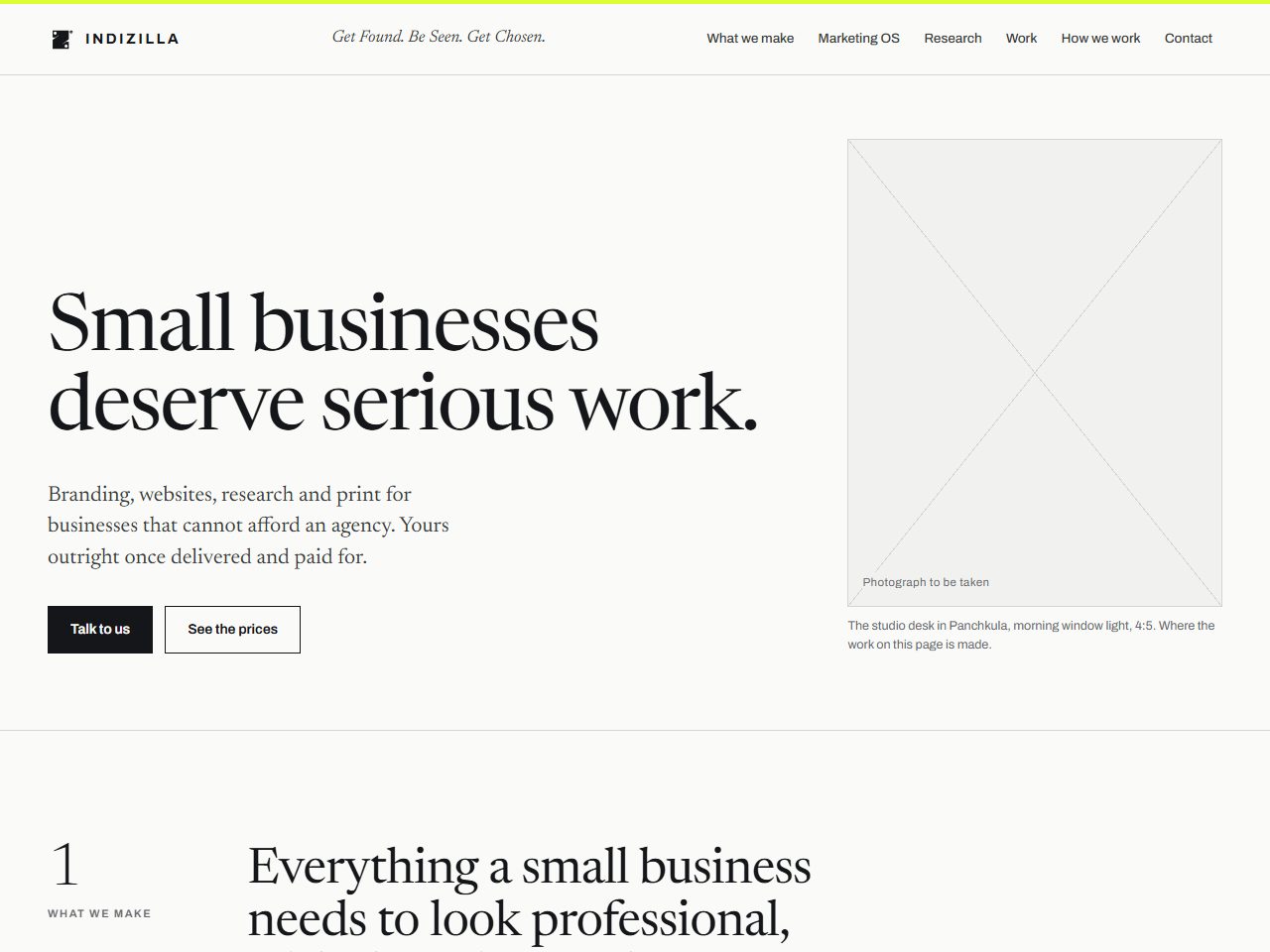
If this business printed a portfolio instead of publishing a website, what would it look like?
The whole thing is standing, every page of it, built on the same prices and the same mark as this site. It is marked on every screen as a direction rather than the live site, and the figures printed inside it are the ones published on the day it was built.
How it was built to look like itself.
- #FAFAF8Paper
- #14161AInk
- #DAFE31Lime
- #556300Lime, on paper
Newsreader
400 at 84px, tracking -2.1px
A variable serif with optical sizes, drawn for reading on screens. Archivo stays for the wordmark, running heads, captions and figures, so the brand is never in doubt.
Everything is square. Only the two product screens take a 6px radius, because they depict software, and that distinction is the only one on the page.
One gesture. Figures rise 6px over 500ms on a strong ease-out, and buttons compress on press. Nothing else moves.
Numbered sections with serif folios and a sticky running head in the first two columns. No eyebrows, no icon rows, no cards for their own sake.
It proved the brand can hold a serif, and it produced a number that is now in the brand bible: lime on paper has to become olive at #556300 or it cannot be read at all.
It reads beautifully and it asks a great deal. Twenty four things on the whole page can be pressed, so a visitor who wants to act rather than read has almost nowhere to go. Choose it when your buyer reads, and pair it with a loud contact page.
A brochure is not a website, and the difference is measurable rather than visual. Count what a visitor can do before you judge how it looks.