 INDIZILLA
The Showroom
Five rooms on one road. Every service is an exhibit behind glass, and every exhibit is a small working model of itself.
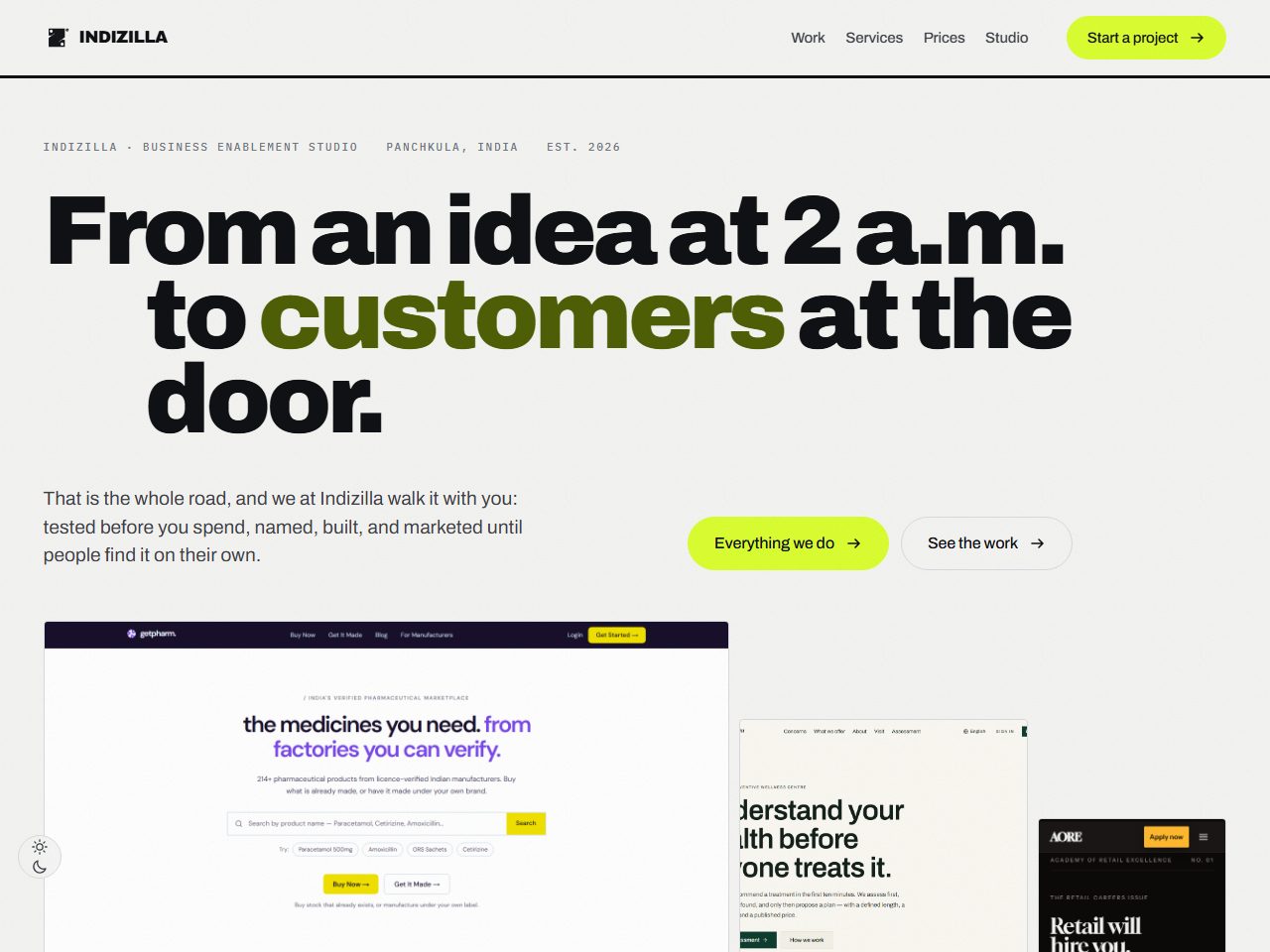
The live site is good but not visually charged. The audience cannot see what we do. Every service should be on its stage page with a visual cue, and should have its own visually charged page.
The whole edition is still standing, every page of it. It is marked archived on every screen, and the prices printed inside it are the ones that were published on the day it was built.
How it was built to look like itself.
- #4A6FA5Test
- #A8552FBrand
- #2F6FEBBuild
- #C9761AMarket
- #15786ACustomers
Archivo
900 at 110.88px against 11px mono
Nothing in the timid middle. Either it is the size of the room or it is a label.
A room is a run of bays that change shape as you walk it: wide with words inside the glass, an unequal pair, a trio, an offset band. No grid of equal boxes anywhere.
Twenty nine miniatures, one per service, each composed to make sense standing still and each playing once and staying played.
The miniatures: the panel answering, the listing climbing past the others, the week filling, the reply landing at 11:40 pm, the budget clamped at the weekend, the price cliff.
The miniatures are the single most valuable thing built in the whole programme, and they are the reason the live site demonstrates rather than describes today.
Of the first version: “only about five percent there … homogenised, no direction … links are not understandable if it is a link or a part of an image or demo.” The second version answered all three faults and was rejected anyway.
If nothing on a card says it is clickable, nothing is. An affordance is not decoration, and a card without an action row is a poster.